Refactoring UI
In the beginning:
- Start with a feature, not a layout.
- Details come later.
- No color yet.
- Don't think about edge cases too much (how will this screen look if there are 2000 contacts.)
- Design a simple version, code it, and repeat-- keep a tight feedback loop between the design and implementation.
- Don't imply functionality in your design that you aren't ready to build.
- Assume things will be hard to build!
- Design nice-to-haves later.
- Figure out your personality-- professional and secure or fun and playful.
- Pay attention to how colors feel to you:
- Blue is safe and familiar.
- Gold might say expensive and sophisticated.
- Pink is fun and not-so-serious.
- Border radiuses are fun and playful, lack thereof is serious.
- Language ("To confirm your identity, please provide a...") can be serious or fun.
- Limit your choices-- too many will be paralyzing:
- Have 8-10 shades of a certain color picked out beforehand.
- Font size
- Font weight
- Line height
- Color
- Margin
- Padding
- Width
- Height
- Box shadows
- Border radius
- Border width
- Opacity
Hierarchy is everything
Deliberately de-emphasizing secondary and tertiary information will clean up your designs.
People rely on font size for emphasis and de-emphasis too much.
- Use three colors of gray for primary, secondary and tertiary fonts.
- Use only a normal font weight and a bold weight.
- Avoid font weights under 400 for anything other than headings.
Don't use gray font or color backgrounds, choose a color with the same hue and change the saturation and lightness.
If you are running into a while trying to emphasize something more, sometimes the only way is to de-emphasize it's surroundings / peers.
You might not need a label: "Email: samzofkie@gmail.com" is worse than plain old "samzofkie@gmail.com", which is clearly an email.
Adding clarifying text is a nice move: "12 left in stock" is better than "In stock: 12".
When you do need a label, like for multiple pieces of data that need to be scannable, de-emphasize it, not the data: "Heart rate: 82bpm" < "Heart rate: 82bpm".
For something like technical specifications, where the user will be scanning for labels like "Dimensions" or "Width", emphasize the label over the data, but not too much!
Headings are often more like labels-- they don't need to be big. You might make headings for accessibility, but then hide them because the content speaks for itself.
Pick elements based on their semantic meaning, and then style them however you want.
Color contrast and weight can balance-- bold font and icons feel heavier because they cover more surface space-- font weight you can adjust, but for icons, the trick is to subdue the color a bit so it doesn't overpower text next to it.
Don't design based purely on semantics: most pages only have one real primary function, some less used secondary actions, and scarecely used tertiary actions:
- Primary actions should be obvious: solid, high contrast background colors.
- Secondary actions should be clear but not prominent: outline styles and lower contrast colors.
- Tertiary actions should be discoverable but non-obtrusive.
Layout and spacing
Give stuff way too much space, and walk it back from there instead of starting with too little space and adding until it looks right.
Breathing room usually feels cleaner and simpler, but dense UIs have their place.
Define a system for spacing and sizing, where values aren't closer than about 25% of one another.
If you only need 600px, only use 600px. Don't default to the full width of the screen.
Do mobile first, with ~400px. Brining something over from a smaller width to a wider width might be less work than you think.
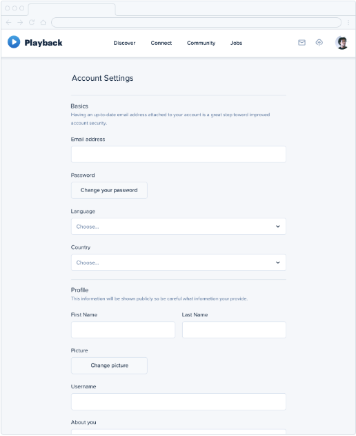
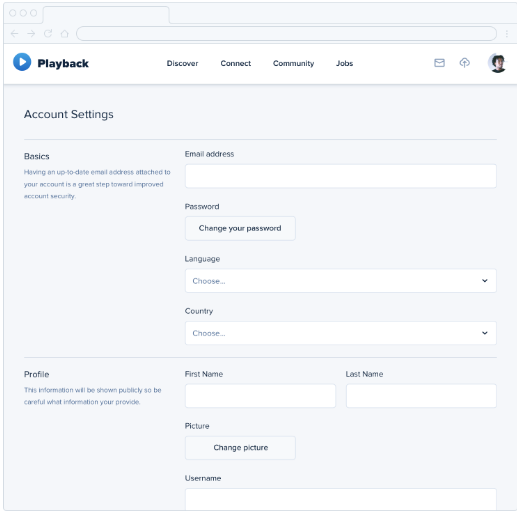
Something that works better at a narrower width but is off balance could get split into columns:


Not all elements should be fluid! Many elements' widths should be fixed and not relative. A sidebar or like, a profile picture to the side of a comment card's widths should be fixed.
Relative sizing doesn't scale. As a general rule, large elements need to shrink faster than smaller elements. Similarly, the font size to padding ratio for a series of different sized buttons would be better off not the same for each button.
Always make sure labels or headings are closest to the thing they're labeling or heading, so there's no ambiguity. This includes icons that are used to label things.
Designing text
User a hand made font sizing scale. Something like: 12px 14px 16px 18px 20px 24px 30px 36px 48px 60px 72px should be good to start.
Use good fonts. Play it safe with neutral sans-serif.
Fonts for headings have tighter letter spacing and shorter lowercase letters, and fonts meant for smaller sizes have the opposite.
Default to popular fonts, and steal ideas from people with good font taste.
Paragraphs should be 45 to 75 characters wide. em units are relative to the current font size, so setting paragraph width to 20 to 30 em should be good.
Always align mixed font sizes by their baseline, the line that they rest on, rather than vertically centered.
Line height should be proportional to paragraph width-- for wide paragraphs (75ish+ characters wide), maybe double spaced. For more medium width paragraphs, maybe 1.5.
Smaller text needs more spacing than larger text.
It's great to color links embedded in text, but links in a context where everything is a link (think YouTube video sidebar) can be emphasized with font weight or darker color (contrast). Secondary or tertiary important links can be de-emphasized even more, maybe with just an on hover underline or color change.
Always left align English. Never center align anything longer than 2 or 3 lines. If it needs to be centered but is too long, rewrite it to be shorter.
Right align numbers.
Always enable hyphenation for justified text.
Usually don't mess with letter spacing. Headline fonts usually have a bit tighter spacing, so if you want to use a smaller font as a headline it might be ok to bump down the letter spacing to make it more headline-y. Also, increase the letter spacing for all-caps text for readability.
Working with color
Use HSL (Hue, Saturation, Lightness). HSB is slightly different.
Your color palette can be broken down into three categories:
- Greys:
- Use 8-10 shades. The darkest should be a little lighter than true black (true black is kinda jarring).
- Primary color(s):
- One maybe two colors.
- Use a spectrum of like 5-10 shades.
- Accent colors:
- You might want a few accent colors: one nice one to highlight new features, one for errors or warnings, one for highlighting a positive trend, ect. Think about how highlight with color can make a feature pop.
- You really might be using like 5-10 shades per accent color.
When picking shades, start with a base color (that will be in the middle of the range).
To pick shades:
- Start with the base color (that will be the middle of the range).
- Then choose the lightest and darkest shades.
- For these it can be helpful to remember what they'll be used for-- the darkest for text and the lightest maybe to tint the background of something.
- Then pick 1-3 colors to fill between the base and the extremes.
Don't be afraid to tweak your palette while working.
Some fully saturated colors seem heavier or lighter than others. To make something seem brighter without loosing saturation, instead of tweaking lightness you can rotate towards a lighter hue.
There is a mathmatical formula for determining a color's perceived brightness based on it's RGB values.
Greys have temperature: add blue hue for coolness and yellow or orange for warmth.
WCAG recommends that normal text (under 18px) have a contrast ratio of at least 4.5:1, and larger text have a ratio of at least 3:1.
- You'd be surprised just how dark you have to make a background color to hit 4.5:1 with white text. The way around this is to use a light colored background with dark text.
Similarly, it's difficult to hit 4.5:1 for colored text on a background color without the text just turning white. If you are also trying to use color to distinguish primary text from secondary text, you can rotate the hue to still hit 4.5:1 and distinguish the primary and secondary colors.
Color is great, but some people are colorblind. If you're using red and green to communicate up and down or good and bad, consider additionally adding an icon to reinforce the semantics.
Colors with similar lightnesses in a graph is useless to colorblind people, so instead of differentiating with hue differentiate with contrast.
Creating depth
You can emulate a light source by creating a slightly lighter box shadow on top, and a slightly darker box shadow below the element (or for a recessed panel, vice versa). It's good to pick the colors by hand (or use your palette).
Shadows can also express "elevation", or like a Z axis, using shadows and blur radiuses. Use small shadows for things like buttons, medium for things like dropdown menus, and big shadows for things like modal dialogs (pop ups).
5 pre-fixed shadow levels is plenty.
Shadows can suggest draggability-- if something pops off the page, it can pass over the other things.
You can create great shadows using two shadows: one that is the light blocked by the object from the light source, and the second is the underside of the object where ambient light has a harder time reaching. The second shadow naturally should disappear the more raised the object gets.
Flat designs lack these shadows simulating depth. In general, lighter objects feel closer and darker objects feel farther away.
You can use short, vertically offset shadows with no blur to create a bit of depth still with that flat aesthetic.
Overlapping elements also easily creates depth in a flat design. Avoid overlapping images without a border though, because they can clash.
Working with images
Bad images will ruin good design: use high quality stock photos or hire a photographer.
Trying to put text over an image? Use a semi-transparent overlay, you could even get by just by reducing the contrast of the photo, or colorizing the image. You can also use a text shadow, with no offest but a large blur radius.
Scaling up icons never works-- they will be blurry, or won't have sufficient detail and will feel chunky. Use an icon intended to be larger or add a colorful background shape to enlargen a small one.
Similarly, don't scale down a screenshot too much-- your users will be squinting to read the tiny 4px font. You could also use a partial screenshot, or if you really want a whole app screenshot, draw a simplified version with details removed and small text replaced with lines.
Don't scale down icons either-- they'll turn to mush. Redraw a simplified version at a smaller size.
Always control the size of a user-uploaded image. Beware of background bleed: when a user-uploaded image has sections that closely match and bleed into the background color. You can solve this by using a subtle border.
Finishing touches
Make bullets, checkboxes and radio buttons big and interesting. Use accent borders. Try using a colorful background color, or one with a subtle gradient. Simple, low contrast geometric shapes or patterns in the background can fill things out nicely.
Don't forget empty states: just plain text that says "No contacts found" when the user first starts using your app isn't very fun or exciting. If you have a complex UI with lots of buttons and dropdowns but the empty state makes all of them useless, consider hiding them until they're useful.
Resist the urge to use borders to distinguish between everything. Use shadows, different background colors, and spacing first.
Do challenge things: a dropdown can be a box filled with icons in an interesting layout. A table could have combined columns or have images in it. Use selectable cards instead of radio buttons.
Leveling up
Always be consuming design. Ask yourself "would I have done that." Recreate designs you like without opening developer tools. Carefully study the work you like.
